192.com redesign
Redesigning the most popular directory in the UK
192.com is the UK’s leading directory website. It has 700 million public records, and the depth of the data is unparalleled. It has 11 million unique users each month. It helped reunite family and friends, deliver the inside track on UK businesses, experts on school admissions and potential property purchase and more.
Researching the problem
Understanding the past to build the future
The original platform was built nearly 10 years ago when 192.com was striving to be the digital format competitor to Yellow Pages in the UK.
The business model revolved around users buying credits to check someone’s contact details.
During this time more data-related features and products were developed and while the platform evolved the design and UI consistency decreased between each iteration and products.
Another factor was the evolution of other tech companies that were capable of offering similar services that made 192.com feel less capable and professional. Even if the data and the tools were adequate for user’s needs, the overall UX lacked behind.
A third factor has been revealed from the analytical data we had on the platform about its users. The user group that was the main source of income was ageing, and most likely these users were not tech-savvy and did not own high-end phones and computers.
Redesigning an established platform
Opportunities and challenges
It is not a secret that users dislike redesigns, especially a platform with 10 years of unchanged design, used by not the most tech-savvy users. People don’t like redesigns for two reasons — changes require efforts to make and people don’t know what to expect from changes.
To improve this, we had to learn how and why users use our product, what’s important for them. That helped us to know the main automatic actions our users can use. Based on this, we better understood how to make a redesign using the existing habits or how to help users easier build new ones.
Also, researching what functions of our products are crucially important for users helped to understand what is important for your users to save this importance in the new design.
Another factor that influenced the design was related to limited time and man resources, since they were shared between other products in development.
The team consisted of a front-end developer, 192 product manager and myself and only temporary help from the back-end. I knew this was a big limitation on the outcome, but still, a lot could be achieved since the platform had a lot of room to be improved.
Easier user flows
Before the redesign, each user journey to search for someone or something would take a different route, logic and UI pattern.
This was reflected in the analytical results that showed a large bounce rate as soon visitors will land on a particular page, ignoring the other products 192.com platform offers.
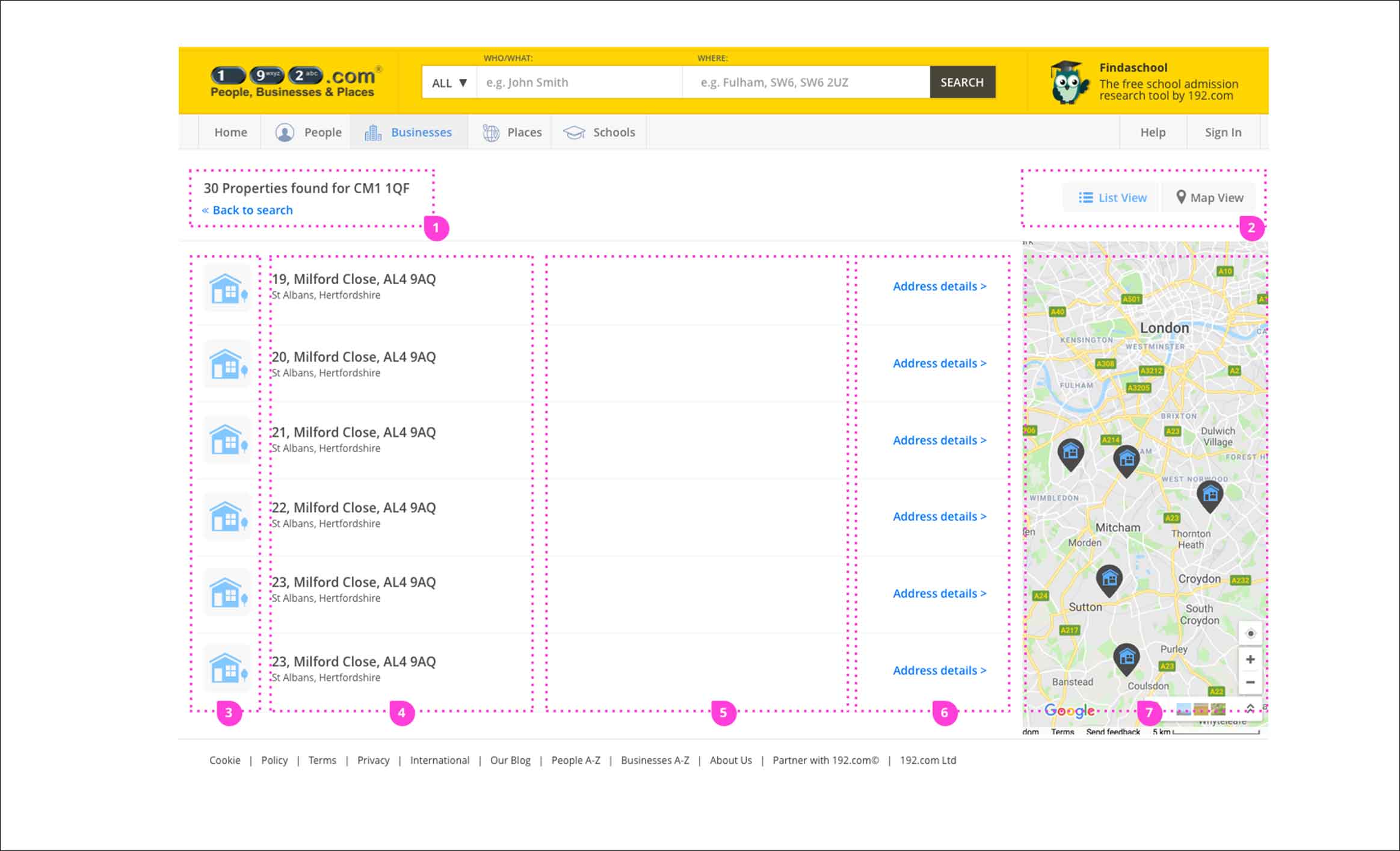
After we studied user’s behaviour and discussed this issue with the stakeholder, we decided to try to unify the UX and use a standard, similar user journey for all the products. To achieve this we decided on the following actions points:
- All page’s layout to be designed using shared consistent UI components library
- Headers with big titles and logical breadcrumbs
- Results list to include a descriptive icon that will confirm and provide familiarity with other types of search.
- Switching between doing a normal or advanced search
- Switching between results in a list or map view
- Reassuring trough colours if a feature can be used free or credits must be purchased
Increased usability
Another focus was to make the design more inclusive and mobile-friendly. This was even more important considering the largest share of 192.com paying customers were in the senior age group, the old UI was barely optimised for usability and mobile use was ignored completely.
We considered key principles based on usability results tests run by the Nielsen Norman Group and we actioned with the following points:
- Making the UI patterns memorable to aid cognitive difficulties
- Large enough clickable UI elements (at least 11 mm diagonally) and far enough apart from each other (at least 2 mm) according to Ollie Campbell–Bigger, bolder UI elements.
- Breaking information into shorter sections
- The colour distinction between links that a user has visited and is yet to visit
- Most important features emphasised and easier to reach while less important features made harder to reach or dismissed entirely
Improving trust through transparent design
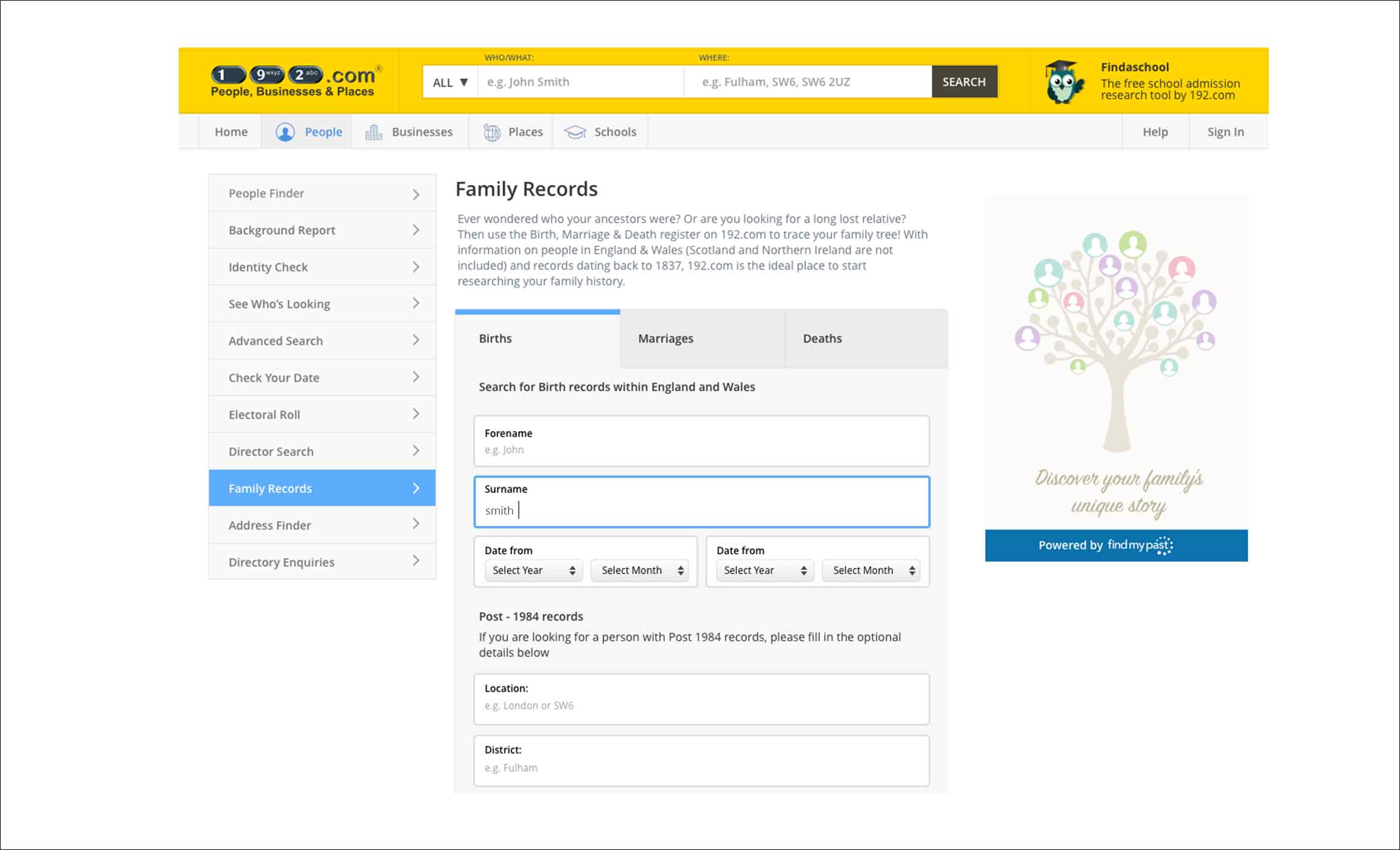
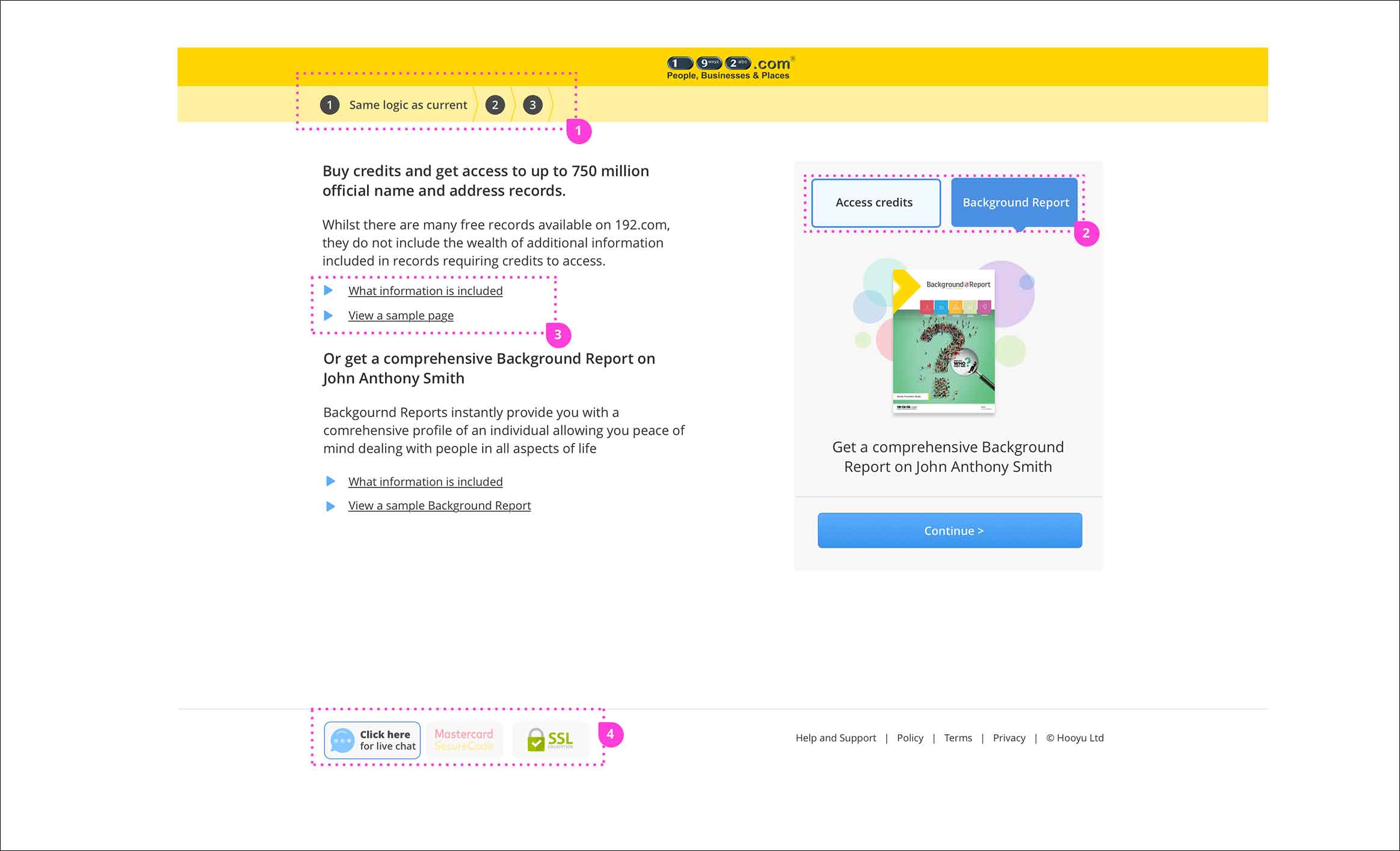
We wanted to improve how the site communicates to users and create a relationship based on trust and honesty by doing:
- Always keeping in sight what are customers price, involvement and benefits
- In every step to display an overview of the purchased product
- On which step they are in the checkout process
- Using different colours for click-to-actions to distinguish between the free or premium purchase
- Security purchase badges
UI Gamification
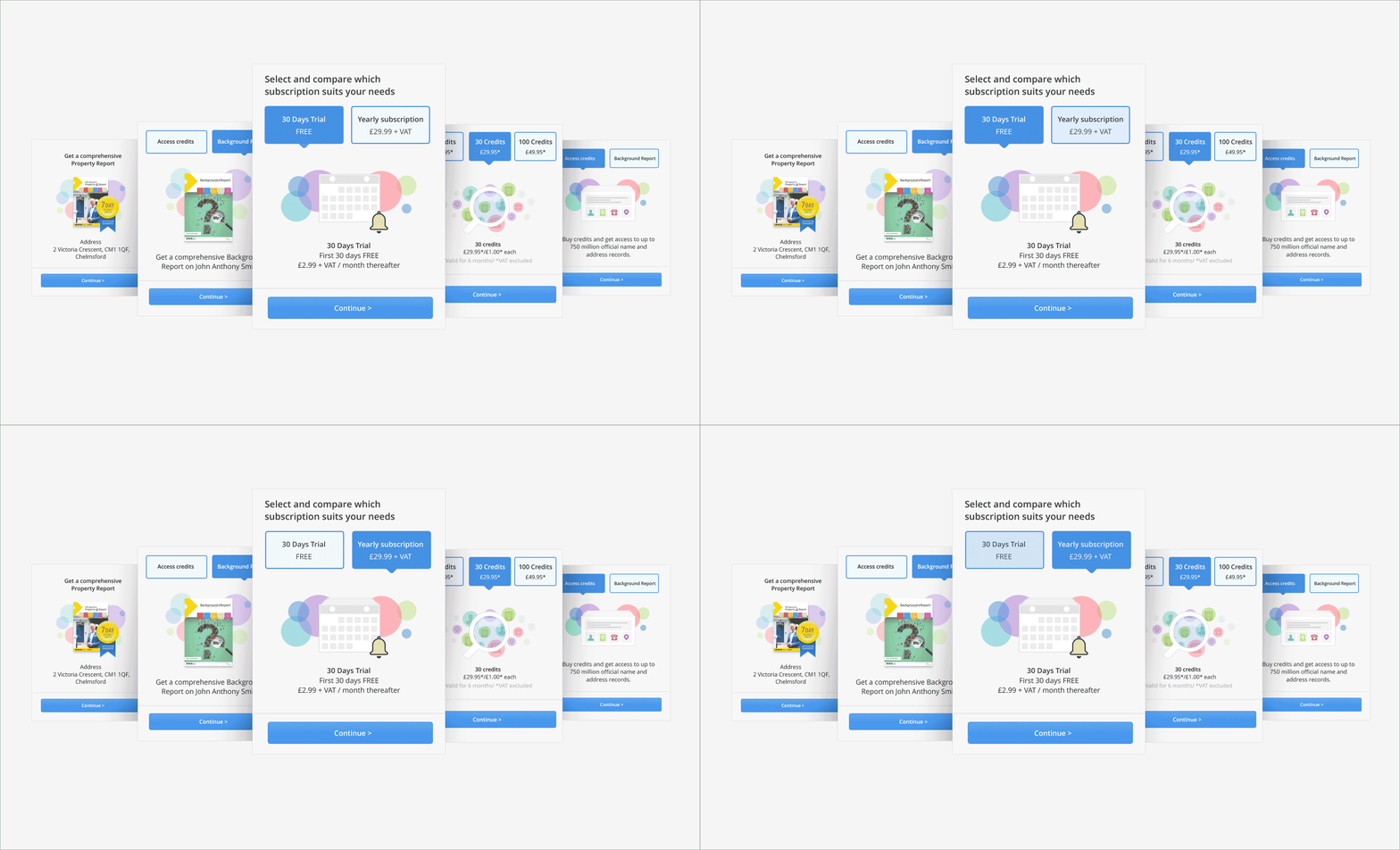
After reading the benefits of the so-called UI gamification, I imagined this would create more engagement and trust with our users, especially a monotonous product that mostly relies on searching and displaying large quantities of data. Navigating a less serious UI puts the users on a fun and enjoyable journey, therefore, they would explore more 192 products and features.
Although we didn’t take the gamification to the degree of Duolingo or Fitbit, where users get rewards and badges for their actions, we opted for a washed-down version. This version was based on big, playful visual elements that represent 192.com products embedded in a fun-to-interact UI.
Making use of modern frameworks and technologies
Address search is a product that helps users to get details, such as crime, schools in the area, property prices and more for properties they plan to buy, move-in or inform about. Although the product is very useful, the search part of the product is outdated and tedious to use with lots of missed searches. Since we were in the process of redesigning the whole platform we decided to update this too.
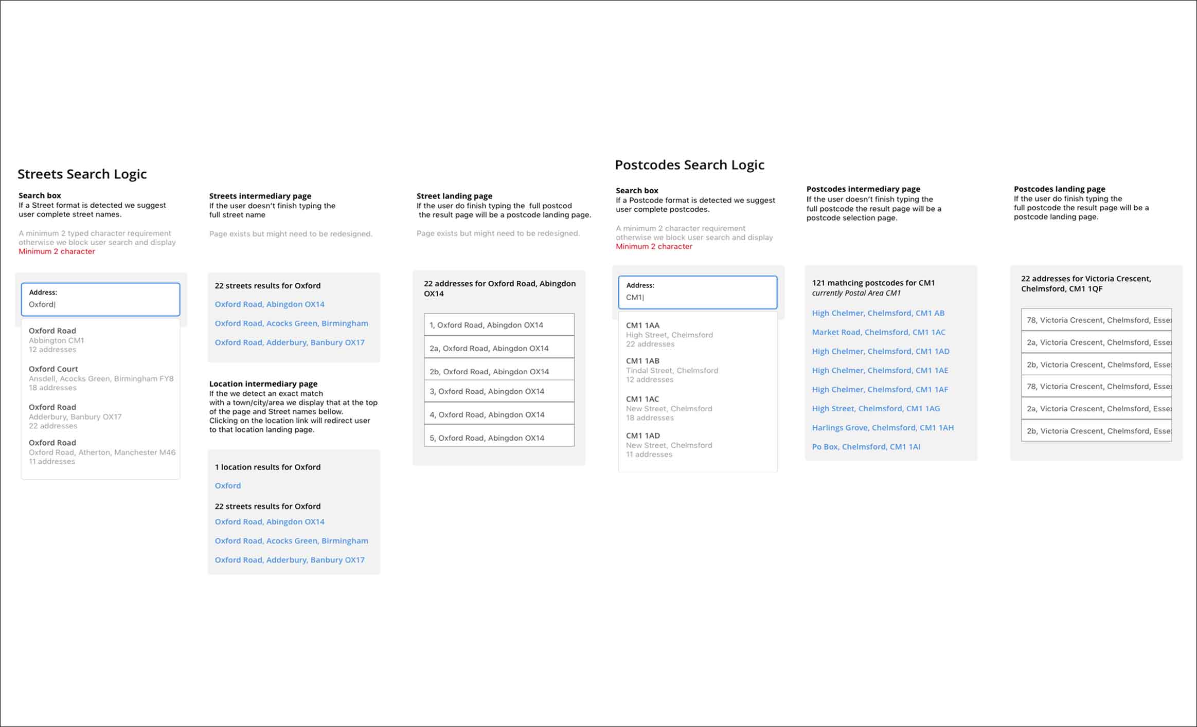
After we made a breakdown on the UK addresses anatomy and looked into how people search addresses, we change the classic search where the search is done after the user types a query and we improved by including a predictive search box.
This works by predicting whether the user searches postcodes or addresses. Further on, if it detects an address search, it will suggest names of addresses and locations based on the algorithm from the attached logic scheme.
Creating a better check out experience
Even if the design was outdated the original UX of the user journey was doing a good job for its purpose, but there was a lot of space for improvement too, even if we were going to involve only front-end changes. After we researched what makes an ORP successful, we went to apply the new learnings on 192.com.
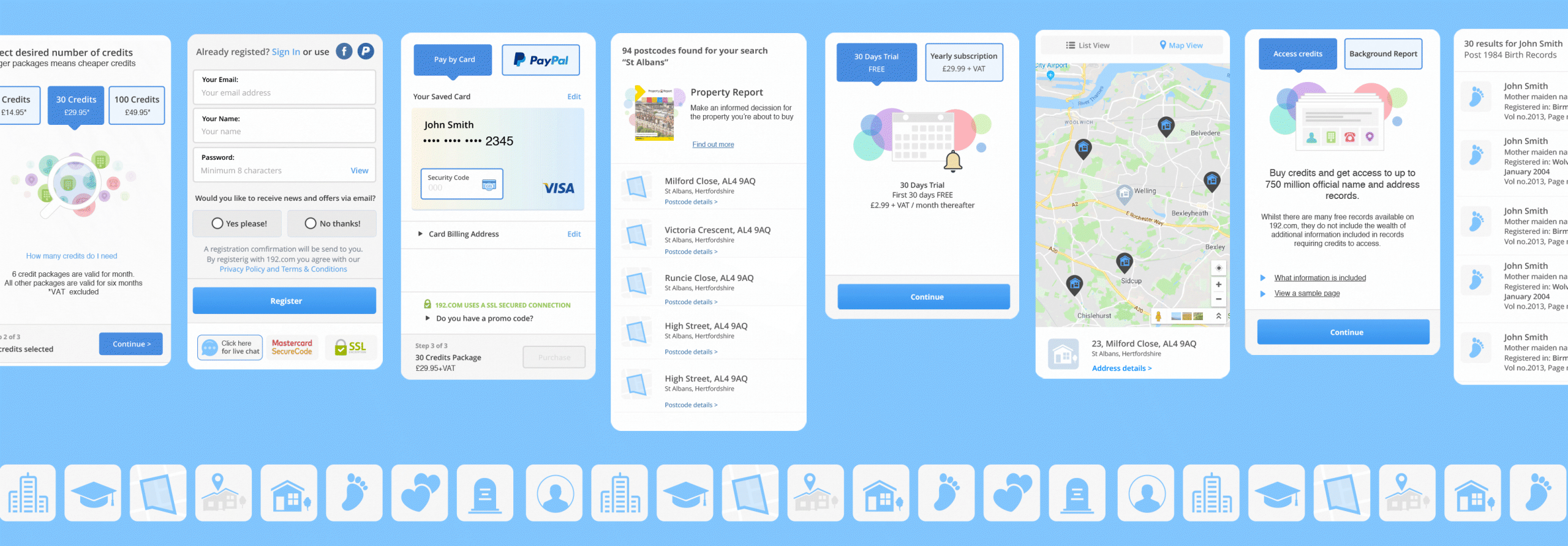
First and foremost, we started from a mobile-first design key principle. The UX is improved for the small estate mobile screens offers. The input fields and the buttons have a large clicking area. A new typography scheme based on larger headers and airy paragraphs makes it easier to navigate through the important sections and improves the content’s visual hierarchy.
Another change that was meant to be mobile-friendly is also the reason responsible for most customers abandonments, the check-out customers’ unclear commitment; The shopping basket, pricing, product description and step indication header are always on sight.
The registration is an optional while for logged in users, we prefill the shopping for with the address and cards details.
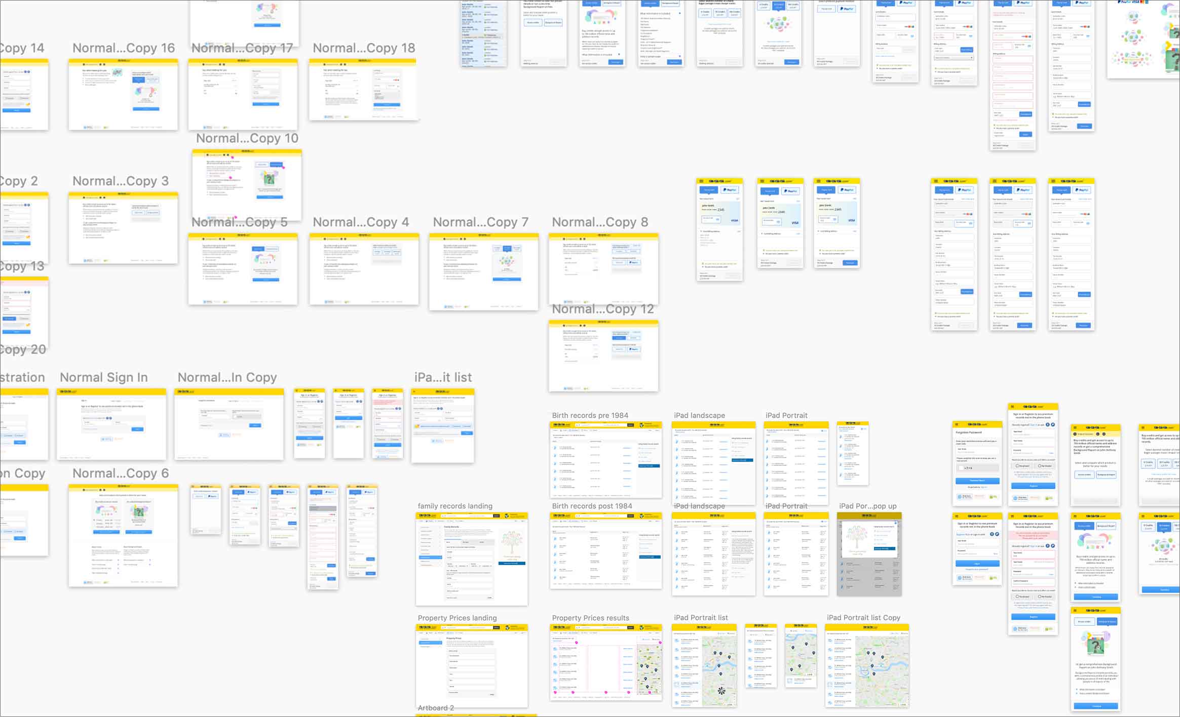
Mobile Checkout User journey
Efficient building using a design system
A design system is a collection of reusable components, guided by clear standards that can be assembled to build any number of applications.
Building a library of design patterns, rules, and UX guidelines helped me build and scale quickly and with confidence while preventing inconsistencies among pages and features.


