Findaschool
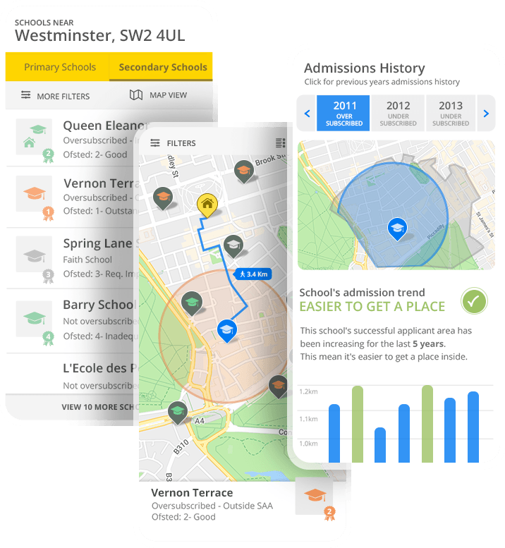
Findaschool is an online platform that enables parents to find a suitable school for their children. Parents can search for local schools and find a wealth of information about catchment areas, admissions criteria, OFSTED rankings, exam results and much more.
Project Involment: Entire product design from research to conception, visualization and testing
Project Duration (MVP): 3 Months
UX Process Roadmap
Generative Research
- 30-minute in-person or video semi-structured interview to gather in-depth qualitative data
- Surveys for quantitive data
- Competitive analisys
User Research
- Define Personas
- Afinity mapping
- Pain-points priotization matrix
Evaluative Research
- (Low-Fidelity) Wireframes
- User usability tests
UI design
- (High fidelity) UI design
- Interactive visuat prototype
Research Goal
Finding a suitable school in the UK is a difficult and complex process fuelled by increasing oversubscription of some of the more desired schools.
Our team wanted to learn how parents or family members proceed when they choose a school for their children. We want to determine what opportunities and needs might exist and discover in what ways we can use technology to help them make a better and informed choice.
Defining the problem:
The first step in our UX design process is defining the problem clearly. Doing this allows us to better understand the core of what we are trying to solve. Designing a deep and meaningful experience for our users as opposed to a simple features, is our ultimate goal.
Since we didn’t had a users data base I first tried to gain some insight into who our potential target users actually are. In order to discover who our users are, we will be collecting raw data by observing, interviewing, and surveying users of existing solutions.
Overarching Research Questions:
When parents consider a school is suitable for their offspring’s? – What are their current pain points?
How users are currently choosing a school? — How do they interact with existing digital offerings?
How do users feel about existing products? — Do they find Catchment Areas valuable?
Generative research
Screening
In order to get the most from the user interviews I set up screening set of questions on Google Forms to make sure I was talking to the right people.
I was interested to talk with parents that in the near future, were going to enrol their child in the school system.
Also, I wanted to talk with parents from various backgrounds, level of education and based on different parts of UK and different size locations.
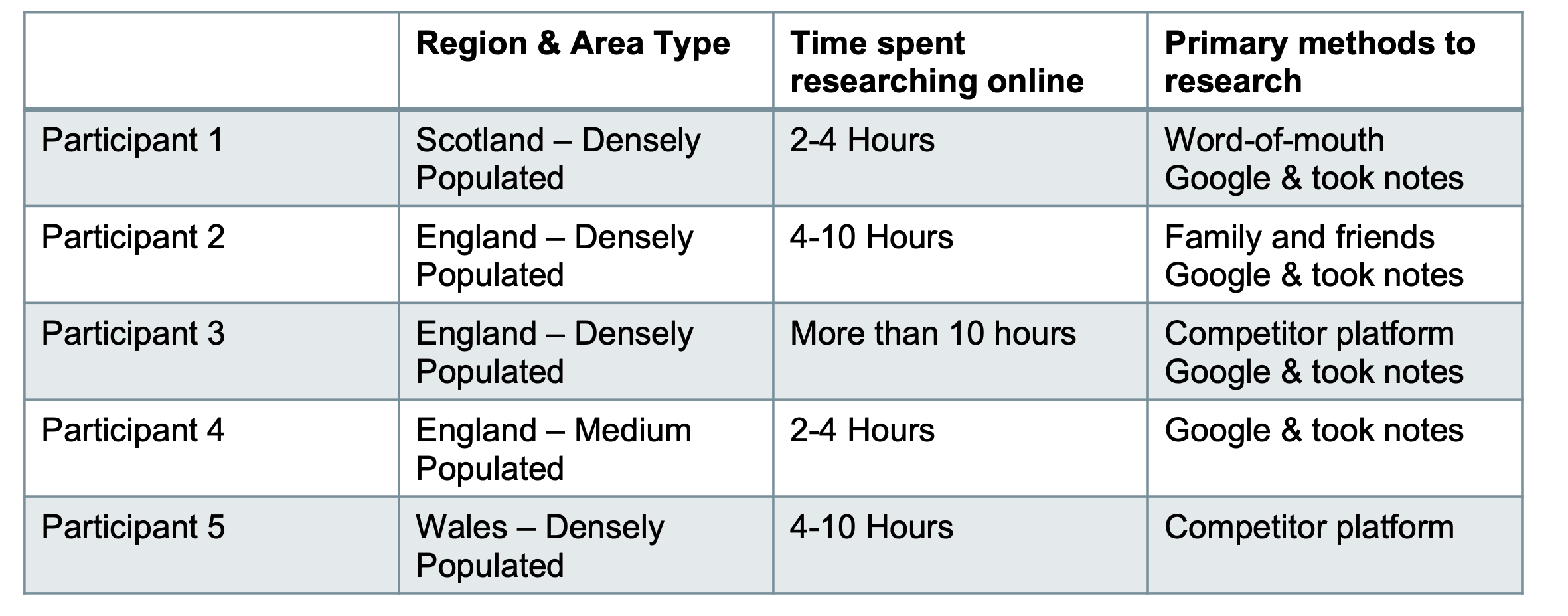
Selected Respondents through screening
User Interviews
I selected and interviewed 5 parents and from their discussions I tried to capture their pains, needs and other important insights.
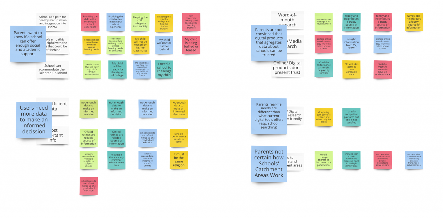
The next step I needed Miro to write down each quote on a post-it note and I’ve arranged them in an affinity diagram. This exercise made easy to distinguish themes and patterns in user’s needs but it also raise more questions that had to be addressed and validated through a survey.
Affinity diagram
Comparative and Competitive Analysis
Researching and analysing our competitors and their users helps us identify where we will thrive in the market. It was still very useful to find more about the current state in this area and explore more the adjacent challenges and opportunities.
User Survey
After the interviews, I noticed a repeating theme from the users. They need more information about schools, such as type, school, religion, census, etc so they can get a better picture.
I pursued to capture this missing information through a survey. Using a 5 steps scale to rate each feature importance would also help me to getter a better view and prioritise which of these type of information should be in our team focus to build but also to collect manually.
Research synthesis
Insight 1: Parents agree there is a lack of trustful and informative digital products
Insight 2: More than half of parent’s prefers to ask around first. Internet is used as a secondary source
Insight 3: In high density cities, searching based on home address is a priority
“How do I know a school hasn’t paid off one of these third party sites to get a better rating?”
“Before I decided on a school, I went to the school and spoke with the principal”
“I could as far as changing my address if I know that are good schools that I could enrol my child at the new place.”
Recommendation 1: Build trust
Perhaps we incorporate some sort of reviews feature on the site, while never forgetting tat social sharing of information also happens offline.
Recommendation 2: Build a user centric product
If the product address the underlaying issues offering a tailored experience without feeling like a one-size-fits-all product user will trust the quality and source of our data
Recommendation 3: Better Search function
We can and should display CA in the school search user flow. Even better we can tell parents what schools are available (unsubscribed or inside CA) at their post code.
Ideation
“How Might We” questions
By defining themes and insights,I’ve identified problem areas that pose challenges to core user. Now, in worder to turn these challenges into opportunities for design, we reframed the insights statements as How Might We questions. We use the How Might We format because it suggests that a solution is possible and because they offer you the chance to answer them in a variety of ways.
HMW bring clarity to Parents how Schools’ Catchment Areas (CA) Work so, based on their home address, they can be less stressed their children will be accepted?

HMW gain trust from our parents so they can be more contained they’re using a product that care for their needs?

HMW offer parrent enough information about schools so they can be confident they are making an informed decission?

HMW help parents to discover schools in a manner that is useful to their needs? (relocation, safer neighbourhood, better quality schools options, same religios etc)

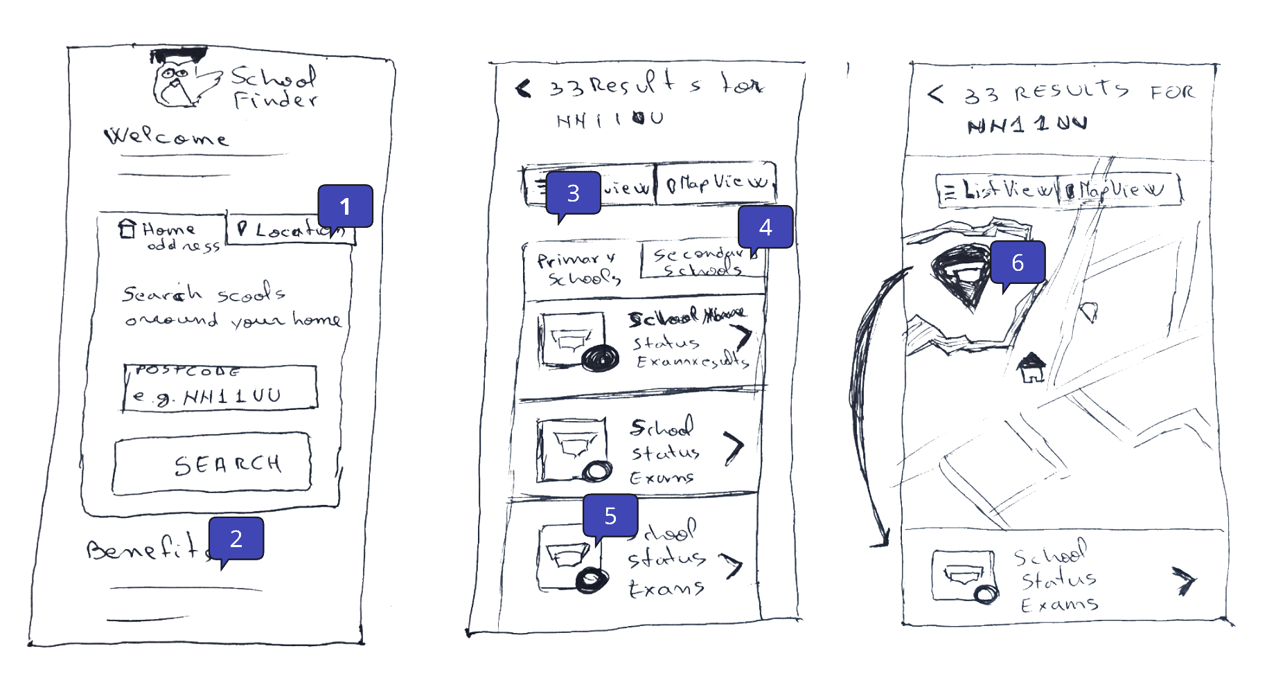
The correlation between the low fidelity sketches and user needs (framed as HMWs)
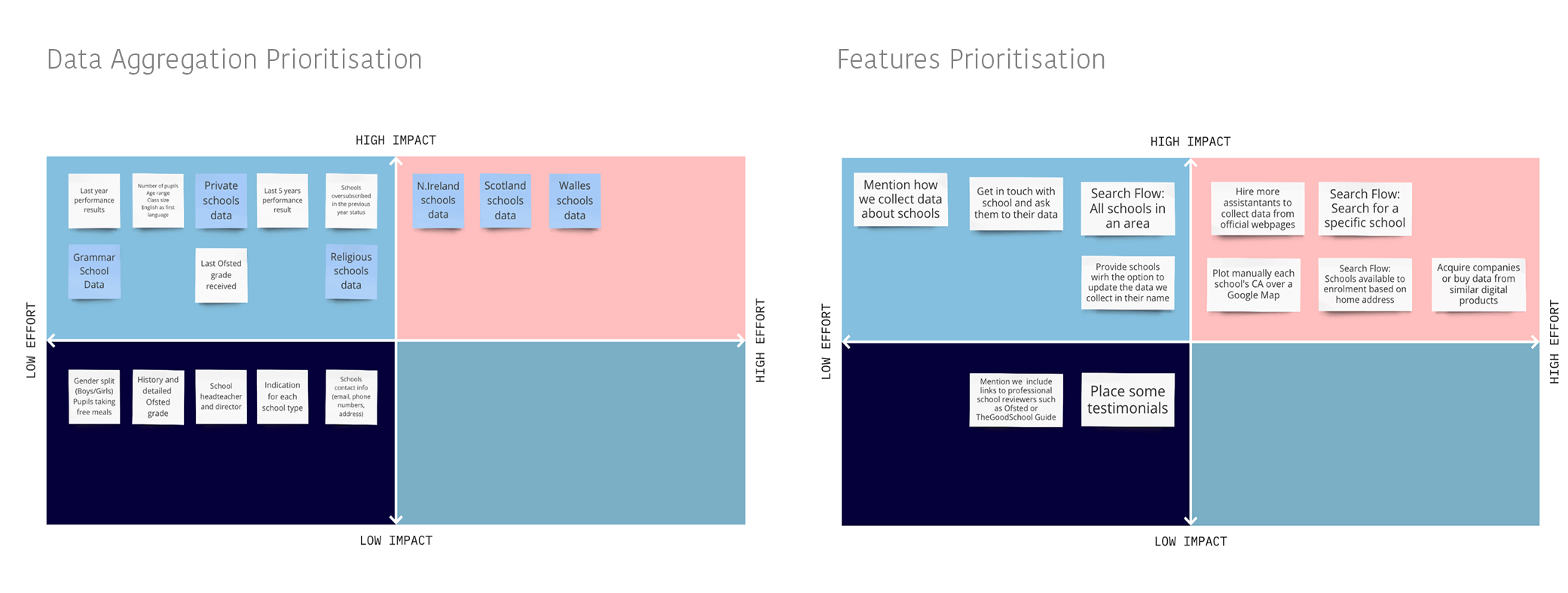
Prioritization Matrix
A prioritization matrix is a 2D-visual that plots the relative importance of features based on two weighted criteria. Using a matrix focuses decision-making on the data, reducing the chances of making decisions based on emotion. I used one for features and one for data collection.
Low Fidelity Design
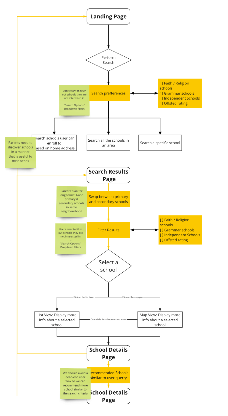
User Flow Diagram
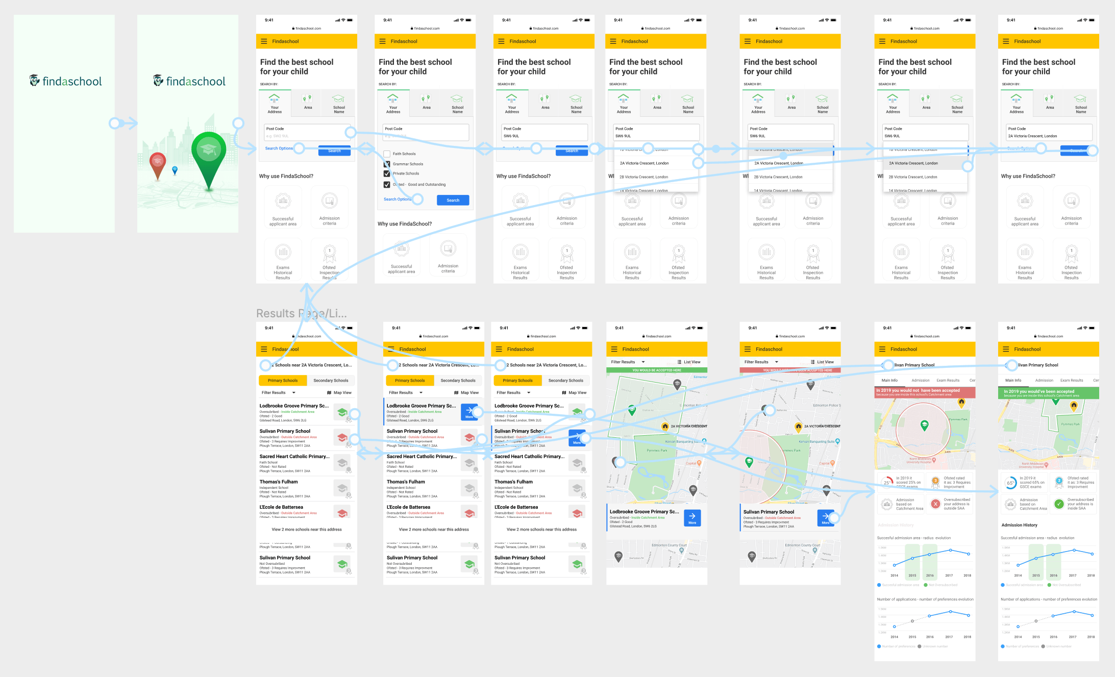
Based on the insights gained from the initial research with potential users, I defined the flow diagram to gain a high-level overview of the user interface and have a basic model of the interactions.
Wireframes and initial tests
With low-fidelity paper prototypes, the general structure of the application could easily be tested in usability tests. Without much effort, adjustments could be made before going into the much more costly digital implementation.
High Fidelity Design
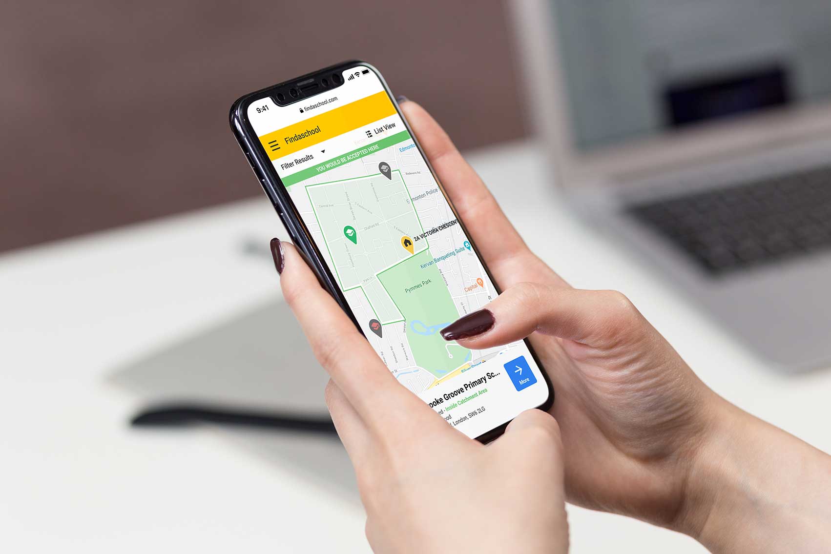
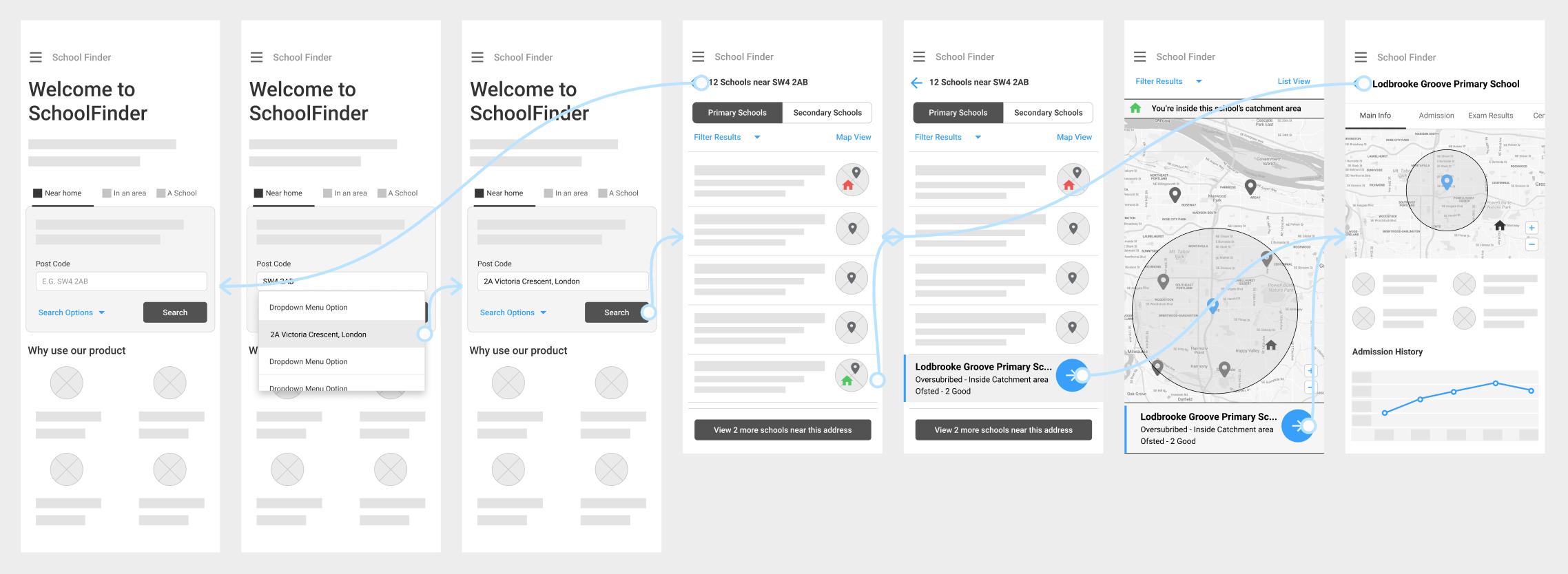
Mobile-First UI Design
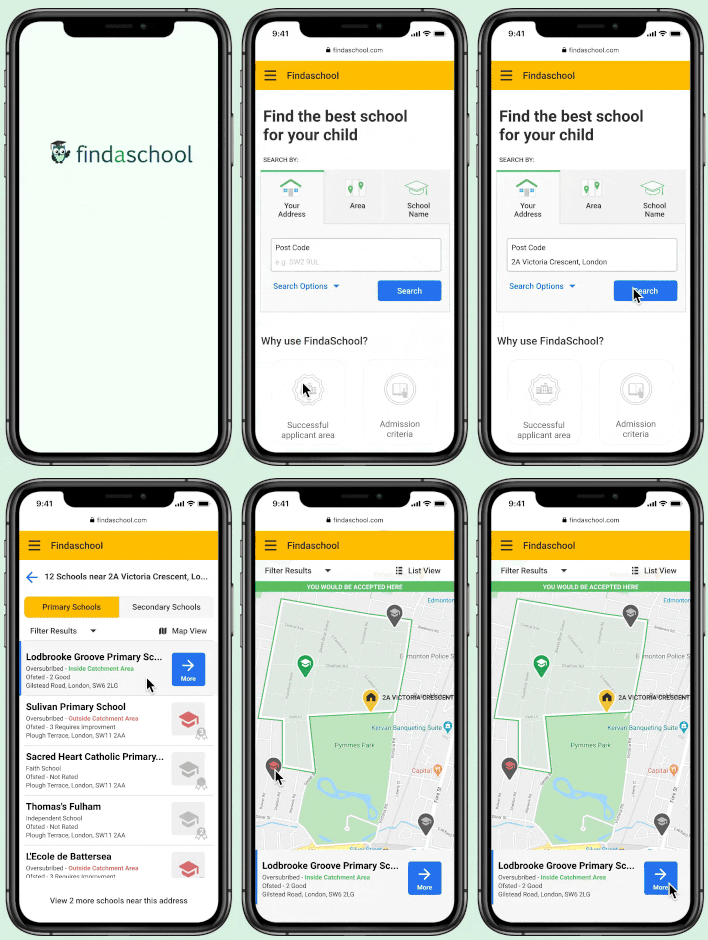
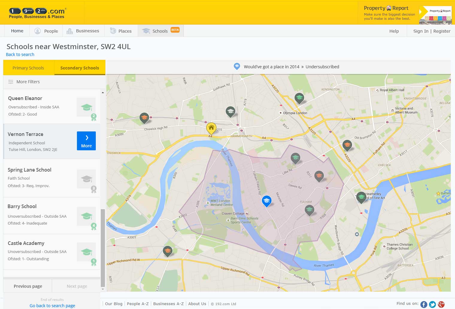
At this point I had everything I needed to make a data backed design decisions for my high fidelity mock ups. I’ve started designing a simple flow for mobile because, as per our research, parents use mobile more than large screens to search shcools. The design is largely based on the 192.com design system, since this is the company that will incorporate Findaschool as one of their products.
Iterate, Iterate, Iterate
To validate the concept I created a high fidelity Clickable prototype that I tested with real users on Lookback. I wanted to observe our corespondents to complete some simple task such as:
Activity 1: Search and identify a local school that will accept your children
Activity 2: Please, find out the GCSE exams score that school got in 2019.
Activity 3: Your best friend has her child at Sullivan Primary School. Find out if this school would accept your child.
Some initial user testing Insights
Insight 1: Slightly steep learning curve.
I noticed how some users are slighty confused first time they use the app, but that once they do it once, they navigate easier through.
Insight 2: Almost no one noticed the map button
Easy fix, make that UI component slightly larger.
Insight 3: Users strugle with to comprehend all the information from the results lists
This can be solved my reducing the quantity of text and enlarging the font
Insight 4: Users need easier micro copy
I see some strugling to understand what exactly some labels means. That should be easy to fix.
UX Design nexts steps: From MVP to a complete product
Design for Web
Page/Feature Description placeholder
Designing an intuitive and user friendly search results page for Web
Page/Feature Description placeholder
Designing for all Catchment Areas edge scenarios
Page/Feature Description placeholder
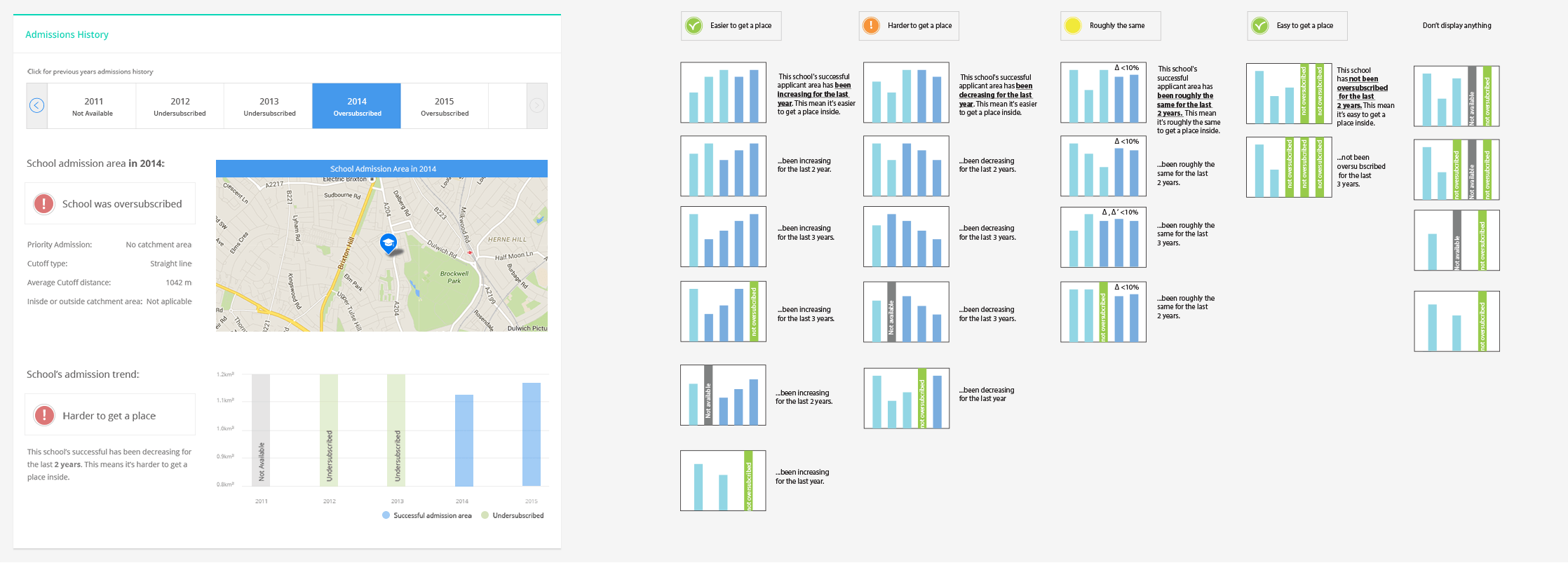
Designing an admission forecast feature based on historical data
Page/Feature Description placeholder
