Andromeda
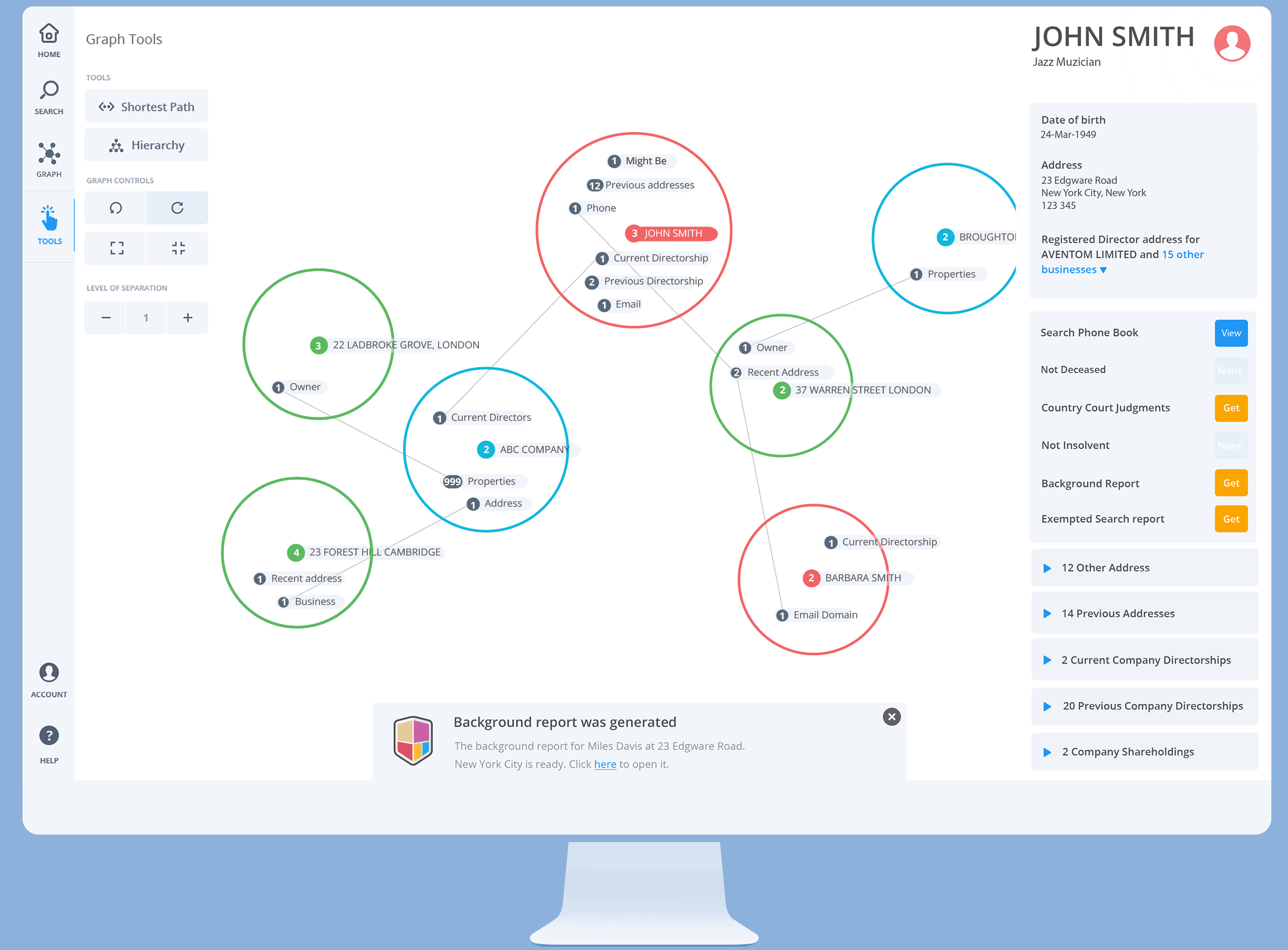
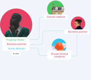
Andromeda is a unique data visualisation service that displays search subjects at the centre of a graph and uncovers links to addresses, people and businesses. Each search generates a visual graph with the search subject at its centre. The graph instantly reveals a summary of all known connections to the subject and the nature of those connections. You can reveal and hide all connections or just the types that interest you.
Its versatility makes it an essential security tool used by known companies such as Apple, Natwest, Ladbrokes in an array of sectors, such as fraud investigations, law enforcement, due diligence and more.
Requirements gathering stage
The first step to build Andromeda was to test the feasibility of a few essential properties that would become the backbone of the project.
A very basic running prototype of something that would become Andromeda was already in development for years. It was a 3Djs running library connected to a small database. It wasn’t very useful in this form, but it allowed us to test how rendering data in a different view would work.
This main concept behind Andromeda is rendering information based on linked properties. Because of the latest technologies advancements such as access to faster and larger cloud databases and more capable end-user machines that allow real-time in-browser rendering, it was the appropriate moment to build it.
Data as interconnected nodes of information
Each entity, also called a node, can be described by a list of properties. Some are unique and some are shared by other entities. This property allowed us to connect various entities to create a visual graph.
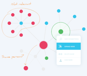
Navigate through relevant pathways
Andromeda connects more than 200 million entities. It was essential to provide access for our user to the entire pool of data in a user-friendly UI, guided by visual cues that allowed control of the direction they consider relevant
Access to various levels of data granularity
A user-friendly interactive graph couldn’t fit too much data so we had to prioritise what belongs in the graph and what is displayed separately in distinct UI panels. On-demand to access external data should also be provided to the user.
Build and fail quickly
Proof of concept exploration
Building a concept of a product rather than a product, I couldn’t take the traditional approach of a UX process.
First, we had to find out if what we considered the products’ core functionality was sufficient for a successful MVP, one that could bring value to users/customers, then check if these relevant features to a complete MVP could be built using today’s’ available software and hardware. We had to explore more.
Creating a graph out of several nodes
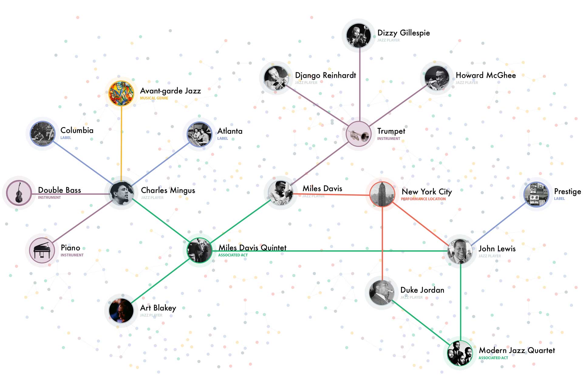
The first thing was to examine what benefit a user would receive “reading” information in a graphical way over the traditional way. For this experiment, I’ve utilised Wikipedia to source Jazz players’ data. I’ve used Jazz since this is a subject that I’m slightly familiar with.
Next, I went see if connecting them through their details/characteristics would improve my ease of understanding this topic, if I recognise new patterns and if I get a better narrative of their behaviour.
A flexible UI painted on an elastic canvas
After gathering more requirements from the stakeholders, I’ve put on a mind map potential features, UI components and interactions the user might need. Overseeing outcomes of a “complete” Andromeda I’ve created many wire-frames to find the most user-friendly and scalable layout.
Interacting with the node
The way the user interacts with the node and the graph would make or break Andromeda so a lot of attention was given to it.
Achieving the best UX was an act of balance between the freedom we give to users to interact with the app and the resources their actions requires.
Interacting with the graph
Some key principles of human-computer interactions state that the user must be in control of the system. He must know how he can interact with the system, how that will change the system and his actions can be reversed to the previous state.
Other usability good-practices were also used to conceive the graph interactions.
Designing Andromeda
As soon as we tested the feasibility of the Andromeda core functionality, we moved to design and build the next components and functionalities that we considered that belongs in the MVP.
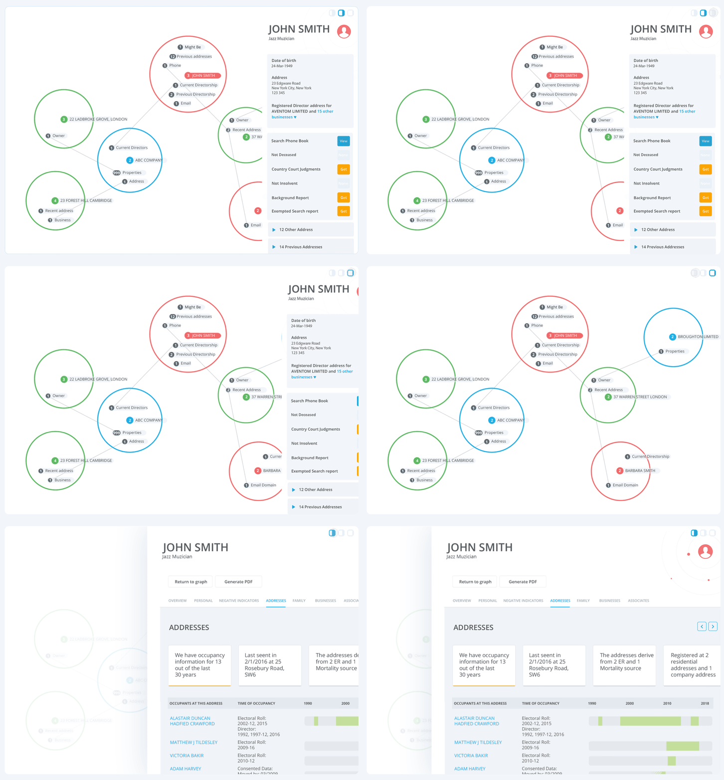
FEATURE USER’s JOURNEY
Accessing different levels of Granularity
A great performance and usability UX improvement on cloud-based applications with access to big data can be achieved if data is loaded only when required by the user.
We settled to 3 levels of granularity for loading and displaying data.
The first level contains bits of data used mostly as visual cues used to interact with the graph.
The second level contains summary information for the active node and is displayed in the Right-Hand Panel.
The third level, details page, displays all the data we had about that node.
FEATURE USER’s JOURNEY
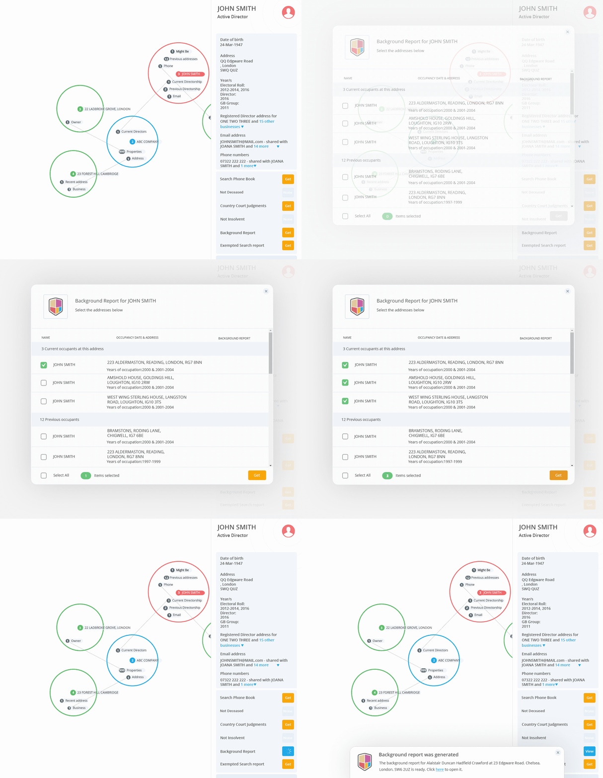
Accessing external data on demand
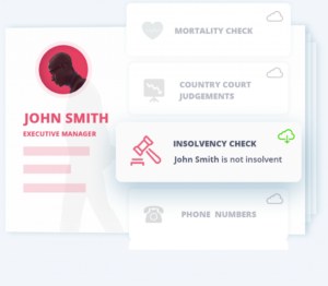
One feature would allow users to connect to various external sources/API’s and get access if they require more data about a selected subject.
My focus was to provide a seamless and intuitive experience for each of these and
⁃ provide a unified experience and make users feel they are part of Andromeda
⁃ provide consistent feedback on each step.
⁃ Use status animations when longer loading times were necessary or errors
FEATURE USER’s JOURNEY
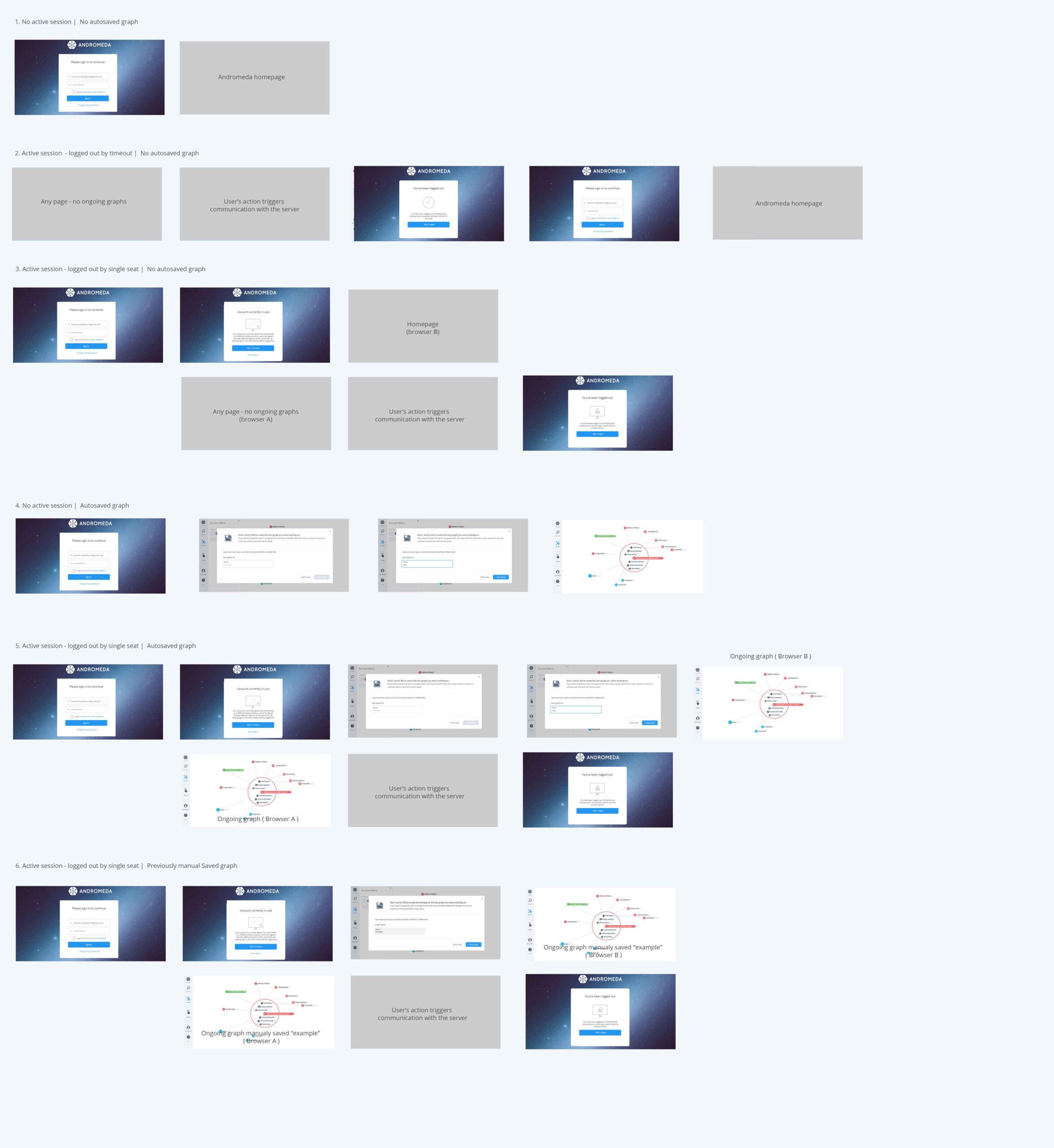
Single user seat
Andromeda is a web app, meaning anyone can open a new webpage and log in. Restricting access to one user per paid seat involved a few issues for a continuous experience.
⁃ Auto-saving any ongoing work left open when user logins from a new window
⁃ Allowing to continue or save him any ongoing work
⁃ Notifying user when is about to log himself out from another instance
⁃ Notifying user when has logged out

FEATURE USER’s JOURNEY
Performing a search
Searching and finding the right result through an enormous pool of data can be a very difficult task so this part seen the most tweaks and iterations.
To create an effective search feature, we wanted to:
- Provide accurate and relevant results.
- Intuitive search layout. The results list has the layout’s priority. We split the search into a basic and advanced search.
- Using effective autosuggest for addresses and for other queries where possible
- Show system status by showing the number of results and pages of results
- Keeping users’ query after they perform the search
- Showing search progress using a visible animation
DESIGN GOOD PRACTICES
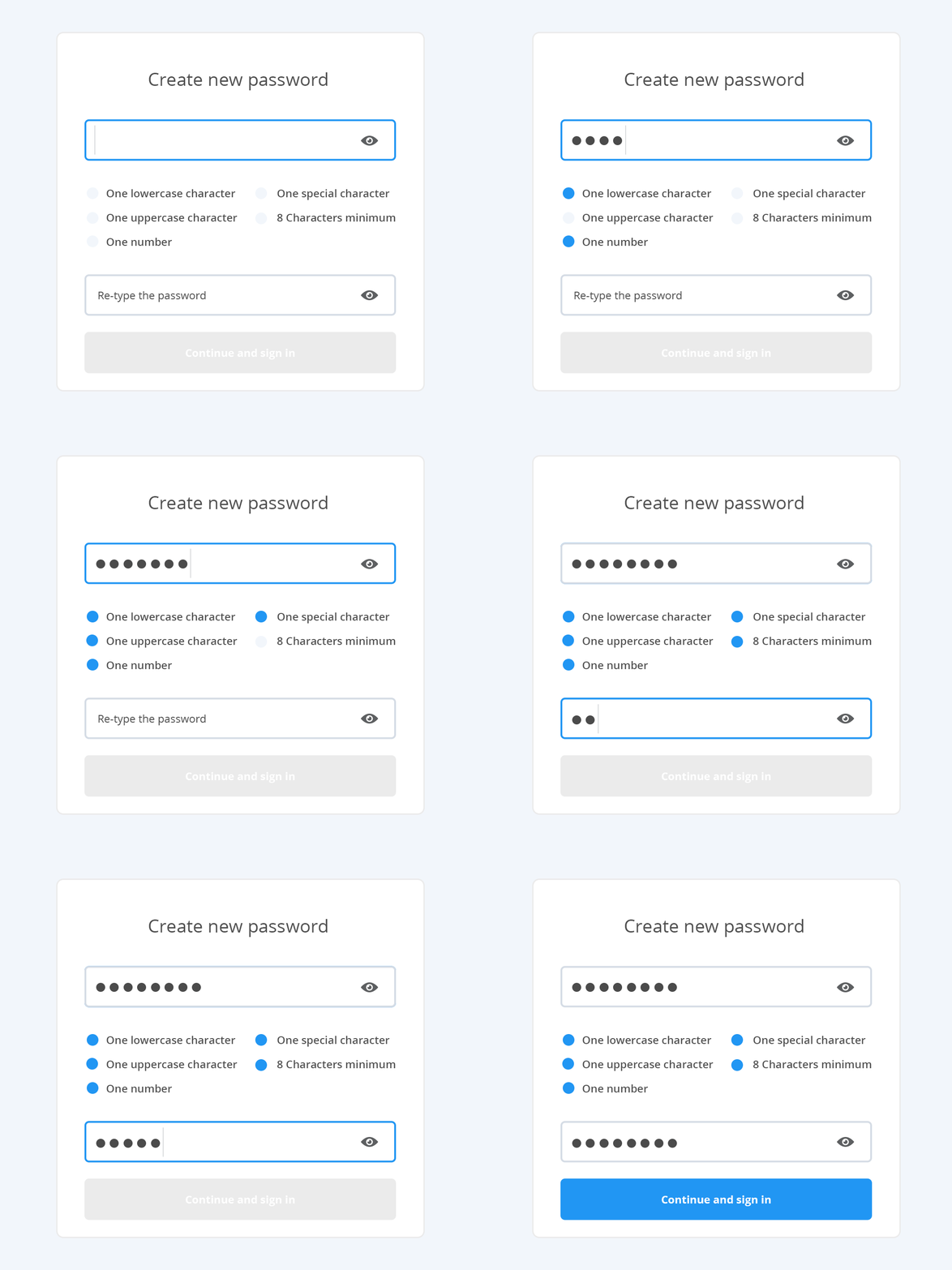
Form validation
We designed form validations to communicate with the users and guide them in areas of ambiguity.
Whenever a user finds difficulty in filling a form or has too many errors on submitting the form, the issue is more emotional than technical.
It is very comforting when users are informed at the time they commit a mistake so they verify immediately before proceeding to the next step.
DESIGN GOOD PRACTICES
Micro-animations
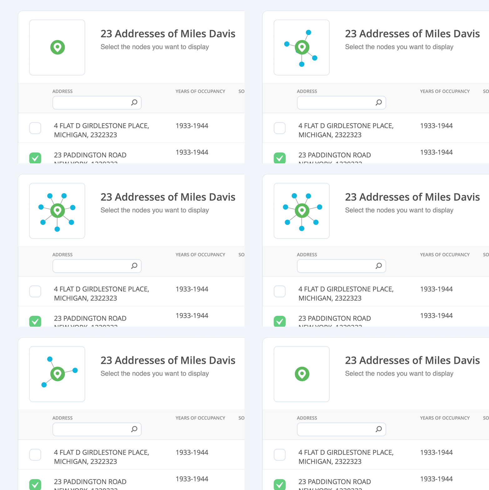
Micro-animations are small functional animations that support the user by giving visual feedback and displaying changes more clearly.
With micro-animations, it’s possible to explain a lot without using a word. In the example above, I’ve used an asynchronous movement of a child node expanding and contracting to the main node.
In this context, it makes clear to the user the possibility of selecting any number he requires to be expanded from the main node, but also the possibility to reverse the process.
DESIGN GOOD PRACTICES
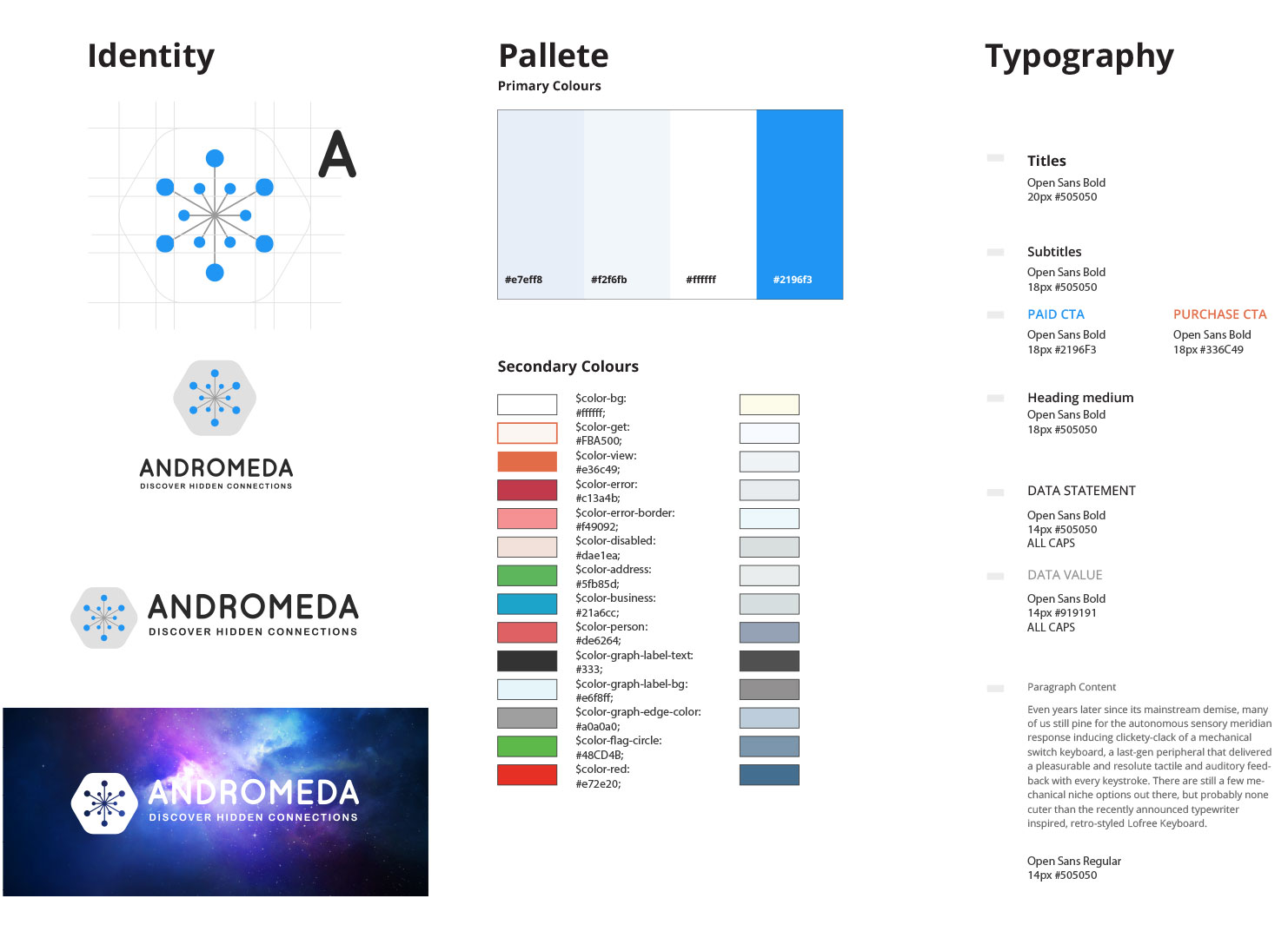
Branding User Guide
A brand style guide takes the heart and soul of your brand—your mission, vision, and values—and translates it into the design. It also tells everyone exactly how to communicate your brand.
Andromeda user guide ranges from logo construction, logo variations, primary and secondary palettes, and typography.
The logo is an organised cluster of connected nodes(stars), and as the name suggests, it pulls the nodes from an infinite pool of nodes/stars. It incorporated a badge that can be used as an app icon.
DESIGN GOOD PRACTICES
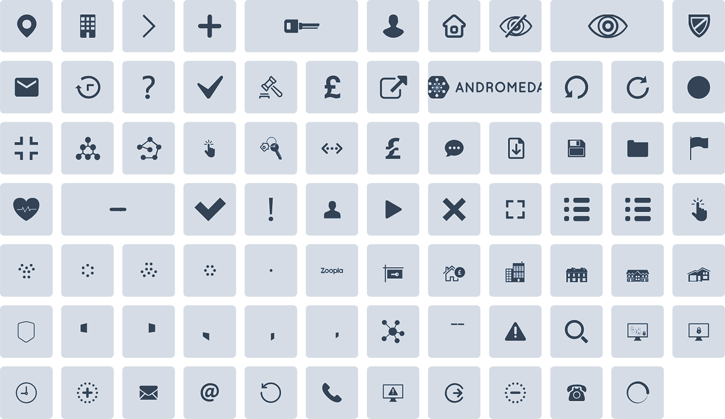
Library of vectors icons
A good UX is also based by the speed the user can use the app so we tried to optimise it on any chance.
One opportunity was to use an SVG library instead of simple image files. This allowed easier customization, great compatibility with any screen resolution, faster loading times and a tidy and consistent UI.
User testing and beyond the MVP
Although we user-tested internally many times every feature as we built it, we wanted to check how everything works together. The MVP was received with great success to the market and everyone found it intuitive and user-friendly, which was a great success giving the peculiar nature of the app.
Various companies use Andromeda with various applications such as fraud investigation, law enforcement, and due diligence. In the future, the number of customers will grow. We’ll collect more feedback and more ideas that enable us to improve and further develop Andromeda.


